Seaborn Plot
Required Input
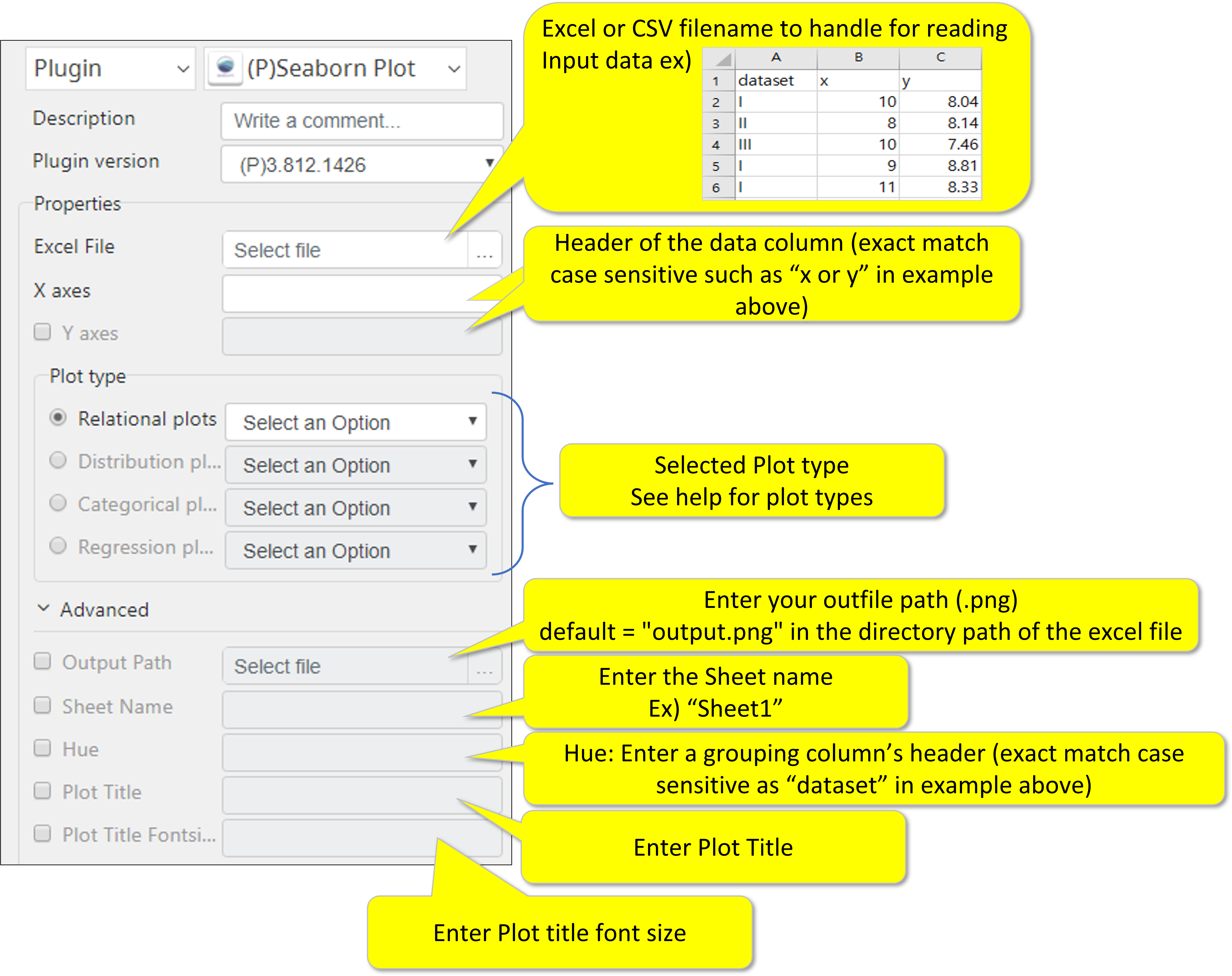
- Input data file (either .xlsx or csv)
- Data header for X and Y axis (header from the first row of the xlsx or csv)
- Please note that the row1 of the xlsx/csv must contain “header” of the data column, meaning the first data starts at row2.
- Plot type
More details here https://seaborn.pydata.org/introduction.html
Optional Input
- Output file path
- Sheet name of the input data
Advanced Parameters
- Hue (color scheme)
- Plot title
- Plot title font size
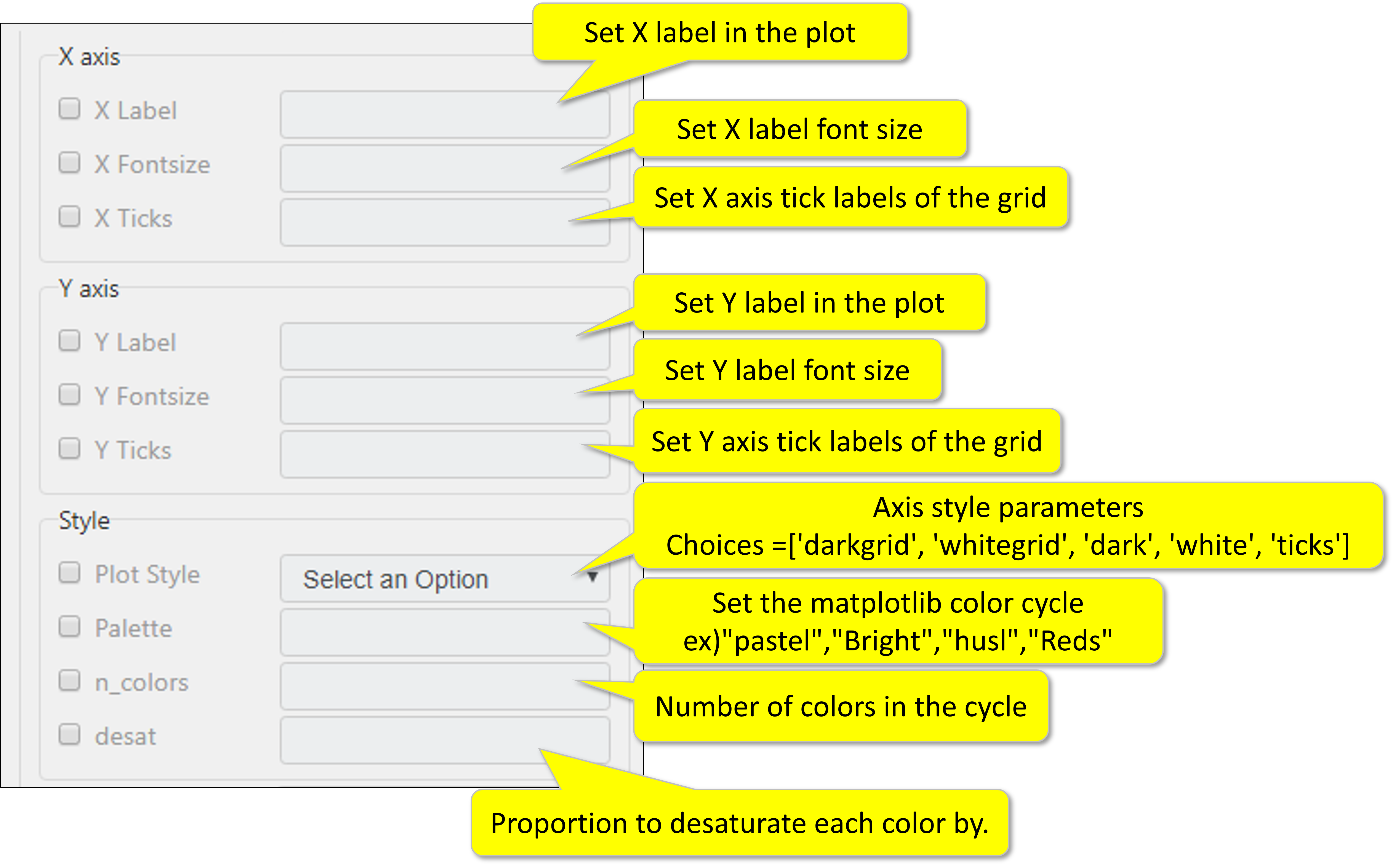
- X axis label, font size, and tick
- Y axis label, font size, and tick
- Plot style (background, grid, color pallet, number of colors, and desaturation rate (proportion)
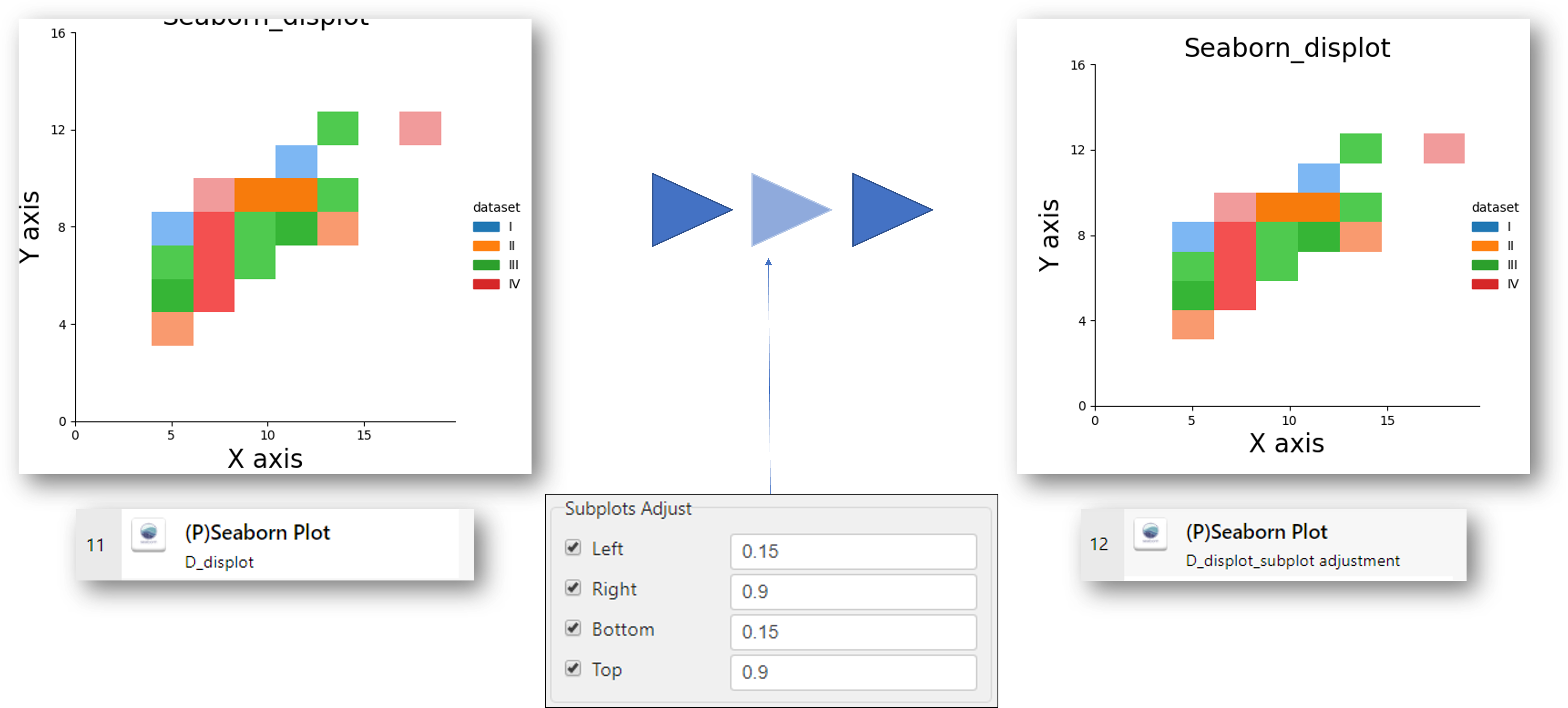
- Subplot adjustment (margin adjustment)
Return Value
- Output file full path (Sting, CSV, or File)
Return Code
- 0 = successful execution
- 1 = any response from the plugin
Parameter Setting Examples
Please note that the row1 of the xlsx/csv must contain “header” of the data column, meaning the first data starts at row2.
Additional Information about Advanced Parameters
Advanced
Output Path : Enter your outfile path(extension .png ,.jpg)
default = "output.png" in the directory path of the excel file
Sheet Name : When using an Excel file, you can select a sheet name.
Hue : Grouping variable that will produce elements with different colors.
Plot Title : Enter the title of the plot (only English)
Plot Fontsize : Enter title fontsize.
X and Y axis
(X, Y) Lable : Enter X and Y axis label in the plot(only English)
(X, Y) Fontsize : Enter X and Y axis fontsize in the plot
(X, Y) Ticks : Enter X and Y axis tick labels of the grid (min, max, step)
Style
Plot Style: Background style of the plots.
choice = 'darkgrid' 'whitegrid’ 'dark’ 'white’ 'ticks’
Palette : Enter a sequence color or palette.
Ex)
n_colors : Number of colors in the palette. (Type int)
Desat : Proportion to desaturate each color by. (Type float)
Encoding: Encoding for CSV file, default is “utf-8”
Subplots Adjust
Options to solve when the title of the plot is cut or overlapped
Left: The position of the left edge of the subplots, as a fraction of the figure width.
Right: The position of the right edge of the subplots, as a fraction of the figure width.
Bottom: The position of the bottom edge of the subplots, as a fraction of the figure height.
Top: The position of the top edge of the subplots, as a fraction of the figure height.
When using subplot adjustment option
- ABBYY Download
- ABBYY Status
- ABBYY Upload
- AD LDAP
- Adv Send Email
- API Requests
- ARGOS API
- Arithmetic Op
- ASCII Converter
- Attach Image
- AWS S3
- AWS Textra Rekog
- Base64
- Basic Numerical Operations
- Basic String Manipulation
- Bot Collabo
- Box
- Box II
- Chatwork GetMessage
- Chatwork Notification
- Citizen Log
- Clipboard
- Codat API
- Convert CharSet
- Convert Image
- Convert Image II
- Create Newfile
- CSV2XLSX
- Dashboard Api
- DashBord Api
- Data Plot I
- Date OP
- DeepL Free
- Detect CharSet
- Dialog Calendar
- Dialog Error
- Dialog File Selection
- Dialog Forms
- Dialog Info
- Dialog Password
- Dialog Question
- Dialog Text Entry
- Dialog Text Info
- Dialog Warning
- DirectCloud API
- Doc2TXT
- DocDigitizer Get Doc
- DocDigitizer Tracking
- DocDigitizer Upload
- Drag and Drop
- Dropbox
- Dynamic Python
- Email IMAP ReadMon
- Email Read Mon
- Env Check
- Env Var
- Excel2Image
- Excel Advanced
- Excel Advance IV
- Excel AdvII
- Excel AdvIII
- Excel Copy Paste
- Excel Formula
- Excel Large Files
- Excel Macro
- Excel Newfile
- Excel Simple Read
- Excel Simple Write
- Excel Style
- Excel Update
- Fairy Devices mimi AI
- File Conv
- File Downloader
- File Folder Exists
- File Folder Op
- File Status
- Fixed Form Processing
- Floating Form Processing
- Folder Monitor
- Folder Status
- Folder Structure
- FTP Server
- Git HTML Extract
- Google Calendar
- Google Cloud Vision API
- Google Drive
- Google Search API
- Google Sheets
- Google Token
- Google Translate
- Google TTS
- GraphQL API
- Html Extract
- HTML Table
- IBM Speech to Text
- IBM Visual Recognition
- Java UI Automation
- JP Holiday
- JSON Select
- JSON to from CSV
- Lazarus Forms
- Lazarus FTP
- Lazarus Grid
- Lazarus Invoices
- Lazarus RikAI
- Lazarus RikAI2
- Lazarus RikAI2 Async
- Lazarus Riky
- Lazarus VKG
- LINE ID Card OCR
- LINE Notify
- LINE Receipt OCR
- Mangdoc AI Docs
- Microsoft Teams
- MongoDB
- MQTT Publisher
- MS Azure Text Analytics
- MS-SQL
- MS Word Extract
- NAVER OCR
- Newuser-SFDC
- OCI
- OCR PreProcess
- OpenAI API
- Oracle SQL
- Outlook
- Outlook Email
- PANDAS I
- pandas II
- pandas III
- PANDAS profiling
- Parsehub
- Password Generate
- Path Manipulation
- PDF2Doc
- PDF2Table
- PDF2TXT
- PDF Miner
- PDF SplitMerge
- PDF Viewer(Start/Stop)
- PostgreSQL
- Power Query
- PowerShell
- PPTX Template
- Print 2 Image
- Python Selenium
- QR Generate
- QR Read
- RakurakuHanbai API
- Regression
- Rename File
- REST API
- Rossum
- Running GAS
- Scrapy Basic
- Screen Capture
- Screen Recording START
- Screen Recording STOP
- Screen Snipping
- Seaborn Plot
- SharePoint
- Simple Counter
- Simple SFDC
- Slack
- Sort CSV
- Speed Test
- SQL
- SQLite
- SSH Command
- SSH Copy
- String Manipulation
- String Similarity
- Svc Check
- Sys Info
- Telegram
- Tesseract
- Text2PDF
- Text2Word
- Text Read
- Text Write
- Time Diff
- Time Stamp
- Web Extract
- Windows Op
- Windows Screen Lock
- Win UI Control
- Win UI Text
- Word2PDF
- Word2TXT
- Word Editor
- Work Calendar
- XML Extract
- XML Manipulation
- Xtracta Get Doc
- Xtracta Tracking
- Xtracta Upload
- YouTube Operation
- ZipUnzip


